Color Psychology in Commercial Spaces: A Guide for Business Owners
In the vibrant canvas of commercial spaces, colors wield a remarkable influence, guiding emotions, and shaping behaviors. At KB Better Construction, we recognize the pivotal role of color psychology in crafting inviting, productive environments. Understanding the nuances of color choices is more than a design principle; it’s a strategic tool for business success. In this guide, we embark on a journey through the psychology behind colors in commercial settings. Unveiling the impact on moods, productivity, and consumer engagement, we explore how thoughtful color selection transforms spaces into captivating, purposeful realms, elevating businesses to new heights.
Understanding Color Psychology in Commercial Spaces
Understanding color psychology is essential for business owners when it comes to designing their commercial spaces. Colors have the power to influence human behavior and emotions, so choosing the right colors for your space can have a significant impact on customer engagement and the overall success of your business. In this section, we will dive deeper into the world of color psychology and explore how different colors can create specific impressions and meanings in commercial spaces. By understanding these nuances, business owners can make informed decisions when it comes to color selection and create spaces that effectively communicate their brand and attract customers.

The Impression of Colors and Their Meanings
Colors have a powerful impact on the impression we create in our commercial spaces. Each color carries its own meaning and can evoke different emotions and behaviors in individuals. Here are some of the most common colors used in commercial spaces and the impressions they convey:
Blue:
Blue is often associated with calmness, trust, and reliability. It can create a sense of tranquility and professionalism, making it a popular choice for corporate settings.
Green:
Green is often associated with nature, growth, and balance. It can create a sense of harmony and relaxation, making it a great choice for businesses in the health and wellness industry or those promoting sustainability.
Red:
Red is often associated with energy, passion, and excitement. It can create a sense of urgency and stimulate appetite, making it a popular choice for restaurants and retail stores.

Yellow:
Yellow is often associated with happiness, positivity, and creativity. It can create a sense of optimism and grab attention, making it a great choice for businesses in the creative industry or those wanting to create a cheerful atmosphere.
Orange:
Orange is often associated with enthusiasm, warmth, and creativity. It can create a sense of energy and enthusiasm, making it a popular choice for businesses in the food and entertainment industry.
Purple:
Purple is often associated with luxury, creativity, and spirituality. It can create a sense of sophistication and elegance, making it a great choice for businesses in the beauty or fashion industry.
How to Use Color Psychology in Your Business
Color psychology can be a powerful tool for business owners to create a visually appealing and engaging environment that resonates with their customers. Here are some tips on how to use color psychology effectively in your business:
Understand your brand:
Before selecting colors for your commercial space, it’s important to have a clear understanding of your brand identity and the emotions you want to evoke in your customers. Think about the message you want to convey and the values you want to communicate. This will guide your color choices and ensure they align with your overall brand strategy.
Consider your target audience:
Different colors have different impacts on people, so it’s important to consider your target audience when selecting colors. Think about their preferences and the emotions you want to evoke in them. For example, if your target audience is in the healthcare industry, you may want to use calming and soothing colors like blues and greens.
Use colors strategically:
Once you have a clear understanding of your brand and target audience, use colors strategically to create the desired impact. For example, you can use bold and vibrant colors to create a sense of energy and excitement in a retail space, or use softer and more neutral colors to create a calming and professional atmosphere in a corporate setting.
Consider the context:
The colors you choose for your commercial space should also consider the context in which they will be used. Think about the surrounding environment, lighting conditions, and the overall design of the space. Colors can appear different depending on these factors, so it’s important to test them in your specific space before committing to a color scheme.
Don’t be afraid to experiment:
Color psychology is not a one-size-fits-all approach, so don’t be afraid to experiment with different color combinations and see what works best for your business. Consider using accent colors or pops of color to create visual interest and draw attention to specific areas or products.
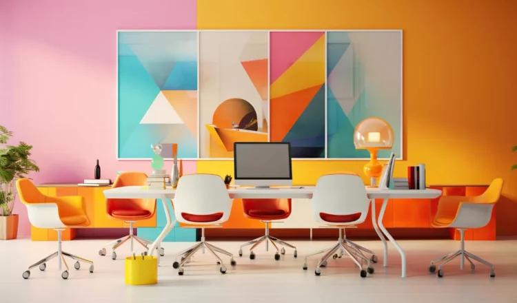
Color Combinations for Maximum Impact
When it comes to color combinations in your commercial space, choosing the right combination can have a powerful impact on the overall atmosphere and impression you create. By carefully selecting and pairing colors, you can maximize the visual impact of your space and create an environment that captivates your customers. Here are some color combinations to consider for maximum impact:

Bold and Vibrant:
Pairing bright and contrasting colors can create a dynamic and energetic atmosphere. For example, combining red and yellow can create a bold and attention-grabbing space, perfect for businesses in the entertainment or retail industry.
Calm and Neutral:
Using a combination of neutral colors such as beige, white, and gray can create a sense of tranquility and sophistication. This color combination is ideal for businesses in the healthcare or professional services industry, where a calming and trustworthy environment is essential.
Monochromatic:
Stick to a single color and use different shades and tones to create depth and visual interest. For example, using various shades of blue can create a soothing and cohesive space, perfect for businesses in the wellness or spa industry.
Complementary:
Pairing colors that are opposite each other on the color wheel can create a visually striking and harmonious environment. For example, combining purple and yellow can create a sense of balance and vibrancy, making it a great choice for businesses in the creative or fashion industry.
Analogous:
Choosing colors that are next to each other on the color wheel can create a sense of harmony and unity. For example, combining shades of green and blue can create a calming and natural atmosphere, ideal for businesses in the eco-friendly or outdoor industry.
Professional Consultation and Implementation
When it comes to implementing color psychology in your commercial space, it’s always beneficial to seek professional consultation and implementation. While you may have a general understanding of color psychology, experts in the field can provide invaluable insights and recommendations tailored to your specific business and industry.
Here are some key reasons why professional consultation and implementation is worth considering:
Expertise and knowledge:
Professionals specializing in color psychology have extensive knowledge and experience in understanding the impact of colors on human behavior and emotions. They can help you navigate through the vast array of color options and guide you towards the most effective choices for your space.
Customized solutions:
Every business is unique, and what works for one may not work for another. Professional consultants can analyze your brand identity, target audience, and desired atmosphere to create a customized color palette that aligns with your goals and objectives.
Attention to detail:
Professional implementation ensures that the colors are applied meticulously and accurately, leaving no room for inconsistencies or errors. They have the expertise to achieve a flawless finish and ensure the colors have the intended impact on customers.
Time and cost savings:
While it may seem tempting to handle the color selection and implementation yourself, it can be time-consuming and costly if not done correctly. Professionals can streamline the process, saving you time, effort, and money in the long run.
Continual support and maintenance:
Professional consultants can provide ongoing support and maintenance for your color scheme. They can assist with touch-ups, adjustments, and any necessary changes as your business evolves or trends shift.
Tips for Maintaining Color Psychology in Your Commercial Space

Once you’ve successfully implemented color psychology in your commercial space, it’s important to maintain it to ensure long-term success. Here are some tips for maintaining the color psychology in your space:
1. Regular maintenance:
Keep your commercial space looking fresh and vibrant by scheduling regular commercial painting. Over time, colors can fade or become dull, which can diminish their impact on customers. By investing in regular painting and touch-ups, you can maintain the vibrancy and effectiveness of your color scheme.
2. Keep lighting in mind:
Lighting can greatly impact the way colors are perceived. Make sure to maintain consistent lighting throughout your space to ensure the desired color effects.
3. Monitor wear and tear:
Keep an eye out for any signs of wear and tear on furniture or other elements in your space. Repair or replace them as needed to maintain the overall color scheme.
4. Reassess periodically:
Consumer preferences and trends change over time. Periodically reassess the effectiveness of your color choices and make adjustments if necessary to stay current and appealing to your target audience.
Conclusion
In exploring the intricacies of color psychology within commercial spaces, the journey reveals the profound impact colors wield on emotions, behavior, and business success. At KB Better Construction, we champion the fusion of science and aesthetics, empowering business owners to harness the potential of colors strategically. Embracing the nuances of color psychology isn’t merely a design choice; it’s a powerful tool for shaping environments that resonate with clients and employees alike. As you navigate the color spectrum for your commercial space, remember, that every hue tells a story—let it be a narrative of success, vibrancy, and lasting impression.